Product 101: Consistency
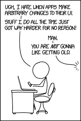
One often-overlooked aspect of great software is that it feels like it was designed by a single person through & through. Or so it seems.

Things look, work, and mostly *feel* the same.
This is trivial at first when you’re the only developer but almost impossible later as your engineering, design, and product teams scale and new colleagues join.
The following are my 8 recommendations on improving the design of your next product without adjusting the color of a single pixel.
1. Do not introduce new concepts recklessly
“Sign in here” yet “Can’t log in?”.
“Register here” yet “Sign up with Google”.
Different words, same thing.
Do not ever use synonyms for the core product concepts of your app.
Instead, be uncompromisingly boring: either use “Sign in” and “Sign up”; or “Log in” and “Register” but never the other.
Boring is great.
Otherwise, your users will be left wondering: Is “user” the same thing as “customer” and “profile”? What about “team member”, “colleague”, and “teammate”?
2. Period at the end of tooltips, flash messages, and error messages
It’s often the small things that add up: Do tooltips end with a period or not? If some do and some don’t, just pick one and unify them.
3. Date formats
Have a set of defined date formats you use throughout the app.
4. Consistent page layout
All pages ought to belong to one of a few categories:
landing page
listing page
dashboard page
authentication page
form page
If none feels right, think twice if you really need to introduce a new behavior to your interface. All pages of the same type should feel and work the same.
5. Short or long-form English? Informal or formal?
Pick a voice and stick with it. I prefer a conversational professional tone:
an informal, friendly, and honest active voice.
✅ “You’ve successfully updated your profile.”
❌ “Profile was successfully updated.”
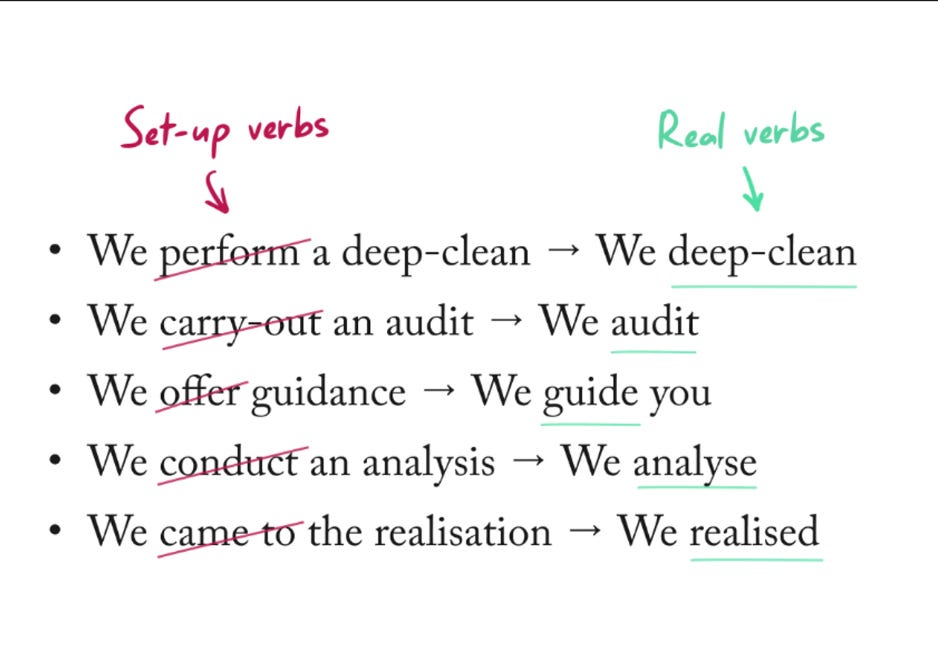
6. Copywriting 101

7. Grammar mistakes
Your interface needs to sound native to your customers in the U.S.
Not a native speaker? Rewatch Suits on Netflix. Use Grammarly or leverage “Make the following sound native” Chat-GPT prompts.
8. Write it down
Codify your UI conventions by writing them down and make all new engineers, designers, and product managers read all of them before they start contributing.
Focus on engineers. They’re the ones who typically make or break consistency.
No designers or product managers can design every possible error message of every form, so your engineers will have to improvise whether you make them focus on consistency or not.
Recommended resources
…or work with us on the next product at Better Stack.


